


In 2025, the majority of your customers aren’t just browsing on mobile, they’re buying there. Mobile commerce is projected to account for more than 75% of global eCommerce sales this year. Yet, even with this dominance, a large number of online stores still deliver subpar mobile experiences.
If your eCommerce store isn’t optimized for mobile-first performance, you’re losing conversions, frustrating customers, and falling behind competitors. The good news? Mobile optimization isn’t rocket science, it’s about focusing on user experience, performance, design, and checkout flow with a mobile-first mindset.
In this in-depth guide, we’ll explore mobile UX best practices, speed optimization, checkout improvements, and Magento/Adobe Commerce-specific strategies to unlock growth on small screens.
Why Mobile Optimization Matters in 2025
Mobile Is the Default, Not the Alternative
In 2015, mobile optimization was optional. In 2025, it’s a survival requirement. Consumers are discovering products, researching options, and completing purchases all from the palm of their hand.
According to recent benchmarks, 81% of leading retail sites still deliver mediocre mobile UX. That gap represents billions of dollars in potential conversions that can be unlocked simply by improving the mobile journey.
Recent data shows that mobile commerce is expected to represent 59 percent of total retail eCommerce sales in 2025. Optimizing for mobile is not optional. It’s essential.
Changing Consumer Behavior
- Shoppers use multiple devices but expect consistency. If they add to cart on desktop, they want to see the same cart on mobile.
- Gen Z and Gen Alpha buyers often use mobile as their primary commerce channel.
- Social commerce (Instagram, TikTok, Pinterest) drives mobile-first discovery that flows directly into checkout.
Key takeaway: Optimizing for mobile doesn’t just make your site usable, it aligns with how your audience shops today.
Discover broader trends in mobile, self-service, and AI in our Future of B2B eCommerce 2025 Strategy Guide
Mobile UX Best Practices for eCommerce

Thumb-Friendly Navigation
Design your site so the most important actions like Add to Cart, Checkout, or Search are within easy reach of a thumb.
- Use sticky buttons at the bottom of the screen.
- Avoid placing critical CTAs in hard-to-reach corners.
- Test with real users: right-handed, left-handed, and different screen sizes.
Streamlined Menus
Mega-menus may work on desktops, but on mobile, they overwhelm. In 2025, leading brands use:
- Collapsible categories
- Quick access icons (cart, wishlist, profile)
- Search-first navigation with predictive results
Fast, Predictive Search
Mobile users don’t want to type. Use AI-driven autocomplete, voice search, and recent searches to help them find what they need faster.
Visual Hierarchy for Small Screens
Mobile demands clarity:
- Large product images with zoom
- Short, scannable descriptions
- Bold CTA buttons with high-contrast colors
How to Optimize Your eCommerce Site for Mobile First
Responsive vs. Mobile-First
A responsive design adapts layouts for smaller screens, but a mobile-first approach restructures the experience from the ground up.
- Responsive = shrinking content
- Mobile-first = rethinking content
For example, instead of showing a long, feature-heavy product page, prioritize price, images, and reviews upfront for mobile users.
Core Web Vitals as Mobile KPIs
In 2025, Google measures LCP, CLS, and INP primarily from mobile. Your rankings and conversions depend on it.
- LCP should be <2.5 seconds
- CLS (layout stability) must be <0.1
- INP (responsiveness) should stay below 200ms
Google continues to refine its Core Web Vitals standards, especially for mobile. Check out this 2025 update to stay ahead.
Learn more about how FCP impacts mobile conversions in this detailed FCP guide
Improving Mobile Conversions on Your Online Store
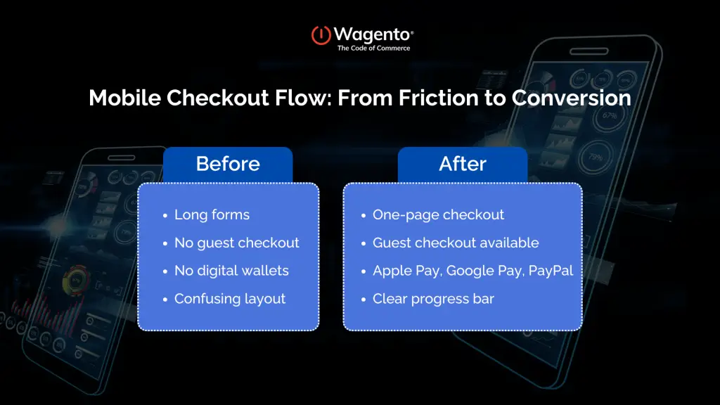
Mobile Checkout Must Be Effortless
Cart abandonment is the single biggest leak in the eCommerce funnel. On mobile, friction multiplies. Best practices in 2025:
- One-page checkout with progress bar
- Guest checkout enabled (forcing account creation is a conversion killer)
- Digital wallets (Apple Pay, Google Pay, Shop Pay, PayPal One-Touch)
- Auto-fill support for addresses and card info
Transparent Pricing & Delivery
The #1 reason shoppers abandon carts? Hidden costs. Mobile users, with less patience, abandon even faster if fees appear late in checkout.
Always display:
- Taxes
- Duties (for cross-border)
- Estimated delivery
Social Proof for Confidence
Mobile shoppers scroll quickly. Placing star ratings and reviews near CTAs builds trust instantly.
Ready to transform your mobile experience into a growth engine?
Mobile Page Speed & Performance

Why Speed Is a Dealbreaker
53% of users abandon if a mobile page takes more than 3 seconds to load. With 5G, user expectations are higher than ever.
Techniques for Faster Mobile Sites
- Compress images (WebP, AVIF)
- Implement lazy loading for media
- Minimize server requests
- Preload fonts and critical assets
- Defer non-critical JavaScript
Magento 2 & Adobe Commerce Speed Tips
Magento has incredible power, but only if optimized properly:
- Enable Full-Page Cache (FPC) with Varnish
- Use Redis for caching sessions
- Deploy HTTP/3 with CDN support
- Optimize MySQL queries
- Regularly monitor via New Relic or Blackfire
Mobile-Friendly eCommerce Design
Minimalism Works Best
Too many popups, banners, or sliders overwhelm small screens. Mobile-first design keeps content clean.
Buttons That Convert
A CTA button should be at least 48px tall, high contrast, and surrounded by whitespace for easy tapping.
Mobile Product Pages
- Show price, reviews, and primary CTA above the fold
- Use expandable sections for specs and details
- Offer swipe-based image galleries
Reducing Mobile Cart Abandonment Rates

Why Customers Abandon
Common reasons include:
- Unexpected fees
- Complicated checkout
- Poor performance
- Payment method not supported
- Long delivery times
Solutions in 2025
- One-tap checkout (Apple Pay, Shop Pay)
- Persistent carts across devices
- Cart recovery messages (email, SMS, push)
- Exit-intent discounts tailored for mobile
Want to customize your Magento checkout for mobile success? Explore our Magento 2 Checkout Optimization Guide.
Mobile SEO & Discoverability
SEO + UX = Growth
Google uses mobile-first indexing exclusively. A poor mobile site = poor rankings, no matter how good your desktop site is.
Best Practices
- Use mobile-friendly themes
- Ensure structured data works across devices
- Optimize Core Web Vitals
- Monitor Google Search Console’s “Mobile Usability” report
The Future of Mobile Optimization
AI-Driven Personalization
Mobile sites are starting to use AI to:
- Adjust layout in real time (adaptive UX)
- Preload add-ons for likely upsells
- Offer chatbot-assisted checkout
Voice & Conversational Commerce
Voice search and AI assistants are making mobile navigation hands-free.
AR & Visual Shopping
Shoppers now expect mobile experiences like AR try-ons and image-based product discovery directly in the app or site.
Want a strategic look at what B2B buyers really want from mobile in 2025? Check out our B2B Bulletin to explore mobile dashboards, buyer workflows, and the shift from UX to data control.
FAQs
Focusing only on responsive design instead of true mobile-first experiences.
Enable full-page caching, optimize images, defer JS, and use Redis plus CDN for performance.
Because of friction: slow pages, hidden costs, complicated checkouts, or missing payment options.
Yes. Mobile-first indexing means Google primarily crawls your mobile site. UX metrics like Core Web Vitals are weighted heavily.
Unless you’re a brand with frequent repeat customers, a mobile-first website is more cost-effective and universally accessible.
In 2025, mobile optimization isn’t just about making your site look good on a small screen, it’s about removing friction at every step of the buyer journey. From faster load times to simplified checkouts and thumb-friendly design, every improvement adds up to stronger conversions and happier customers. If you are ready to capture more sales and stay ahead of the competition, now is the time to act.